Money-Saving Hub
User need: After researching the cost of living crisis in subject areas that were relevant to Confused.com’s products, I found that users were looking for ways to save on insurance, as well looking for help, funding, savings tips and more surrounding the cost of living and energy crisis.
The problem
This landing page lacked a clear purpose and was near impossible for the user to find organically. The page contained important information that users were searching for, but wasn’t SEO optimised and couldn’t be located on site without a direct link.
What I did
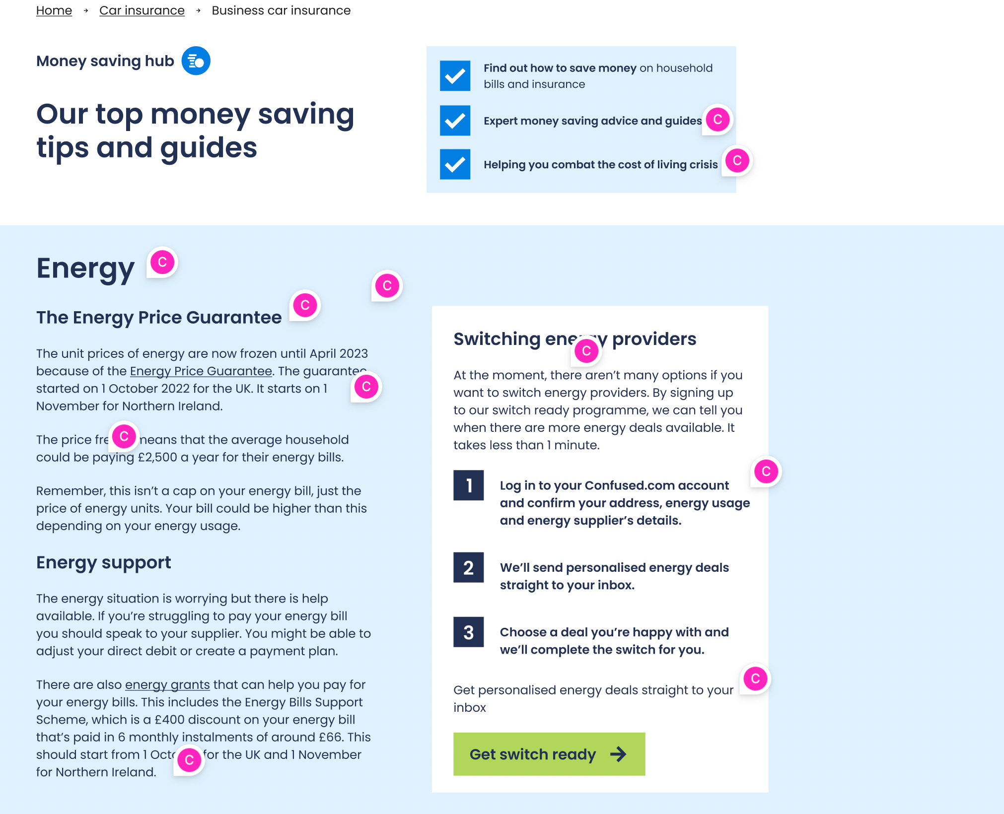
As part of a Cost of Living Crisis working group, I led a user research project on the cost of living and energy crisis in relation to Confused.com’s services and insurance products. I repurposed Confused.com’s money-saving page into a central hub of tools, tips and resources designed to help people navigate the cost of living crisis and save money, addressing all of the user’s cost-saving needs.
The outcome
I repurposed our existing money-saving page to create an efficient money-saving hub to address the user needs i had identified in my research. I also worked with visual design to create a new page design including a new tabbed module to better display this information within the product categories that I defined.
”Courtney is extremely driven and passionate about making sure the user is at the front of everyone’s mind and this comes across in her work.”
The process
Content Refresh
There was an existing page on site that I intended to repurpose as part of this project. So to start, I worked closely with the Senior Editorial Content Executive to refresh the existing content on the page.
The end result I wanted to create was a long-term goal, and I needed to create a faster solution. So I decided to create an interim page before the final version.
New use for product colours
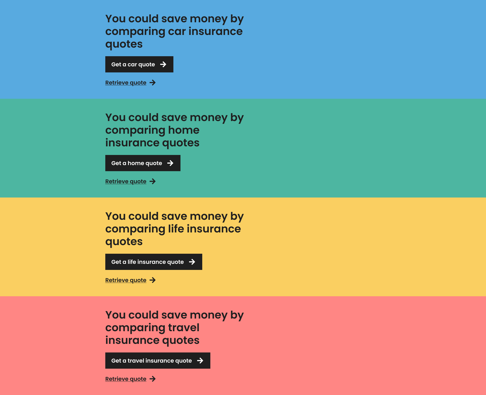
At the time, we were also launching the new redesign of Confused.com. The new style of the website categorised each product as its own colour to make our products more easily identifiable.
But as the money-saving hub wasn’t a product, and the first page that housed multiple products, it required a new design approach.
I used the monotone design that we used for non-product pages as a foundation, but also included the product colours to highlight the different product sections of the hub and make information easier for the user to find based on what they would expect from looking at the rest of the website.
New design approach
Once the interim version was live, i started working on the final page. With the aim to create a central hub for all money-saving content, I worked with the senior visual designer to create a new design approach.
Our new design system didn’t have a way to display this information. So I suggested creating tabs that could be displayed within product-specific modules.
The idea was that this tabbed module could also be flexible for use across the website, especially on landing pages. Once the design was ready, I set up a meeting with web producers, developers, SEO and design to discuss how we could implement this idea site-wide.


