Tools and calculators
Goal – Redesign the tools and calculators on site to make them more user-friendly, accessible, and informative. Identify the main problem areas and develop a plan to address them.
The problem
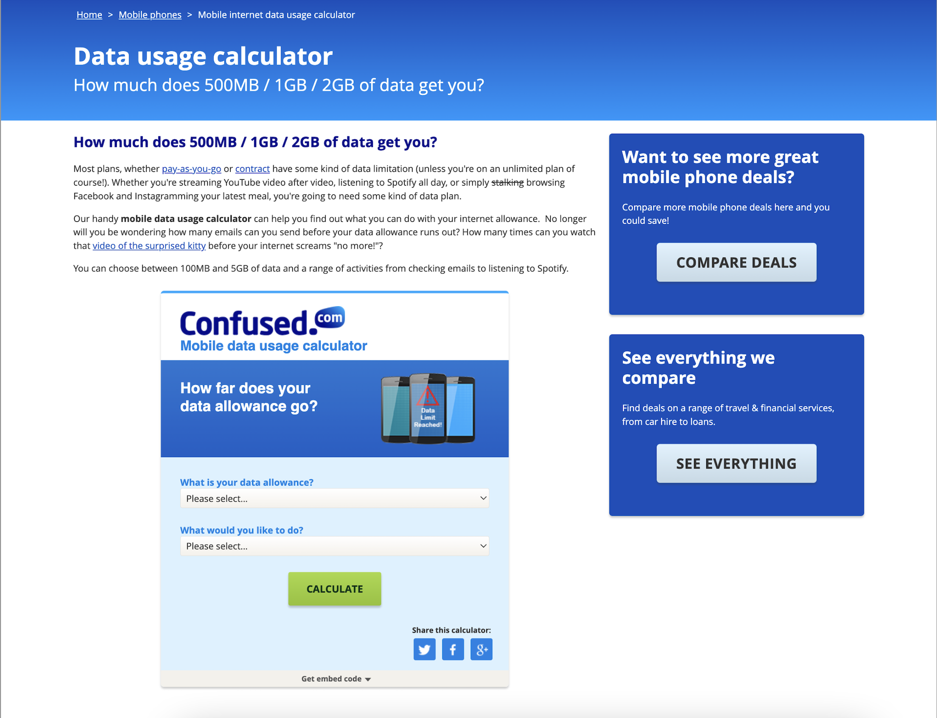
We had a very disorganised workflow for the creation/redesign of tools and calculators. The UX on older calculators needed improvement and the calculators hadn’t been created in tandem with the pages they were on.
What I did
I led the content design on this project, but first had to create a new process for creating tools and calculators. Then, working with a visual designer, we began a calculator 2.0 project and brought every tool back to the begining stages to re-evaluate their purpose, content, UX and visual design.
The outcome
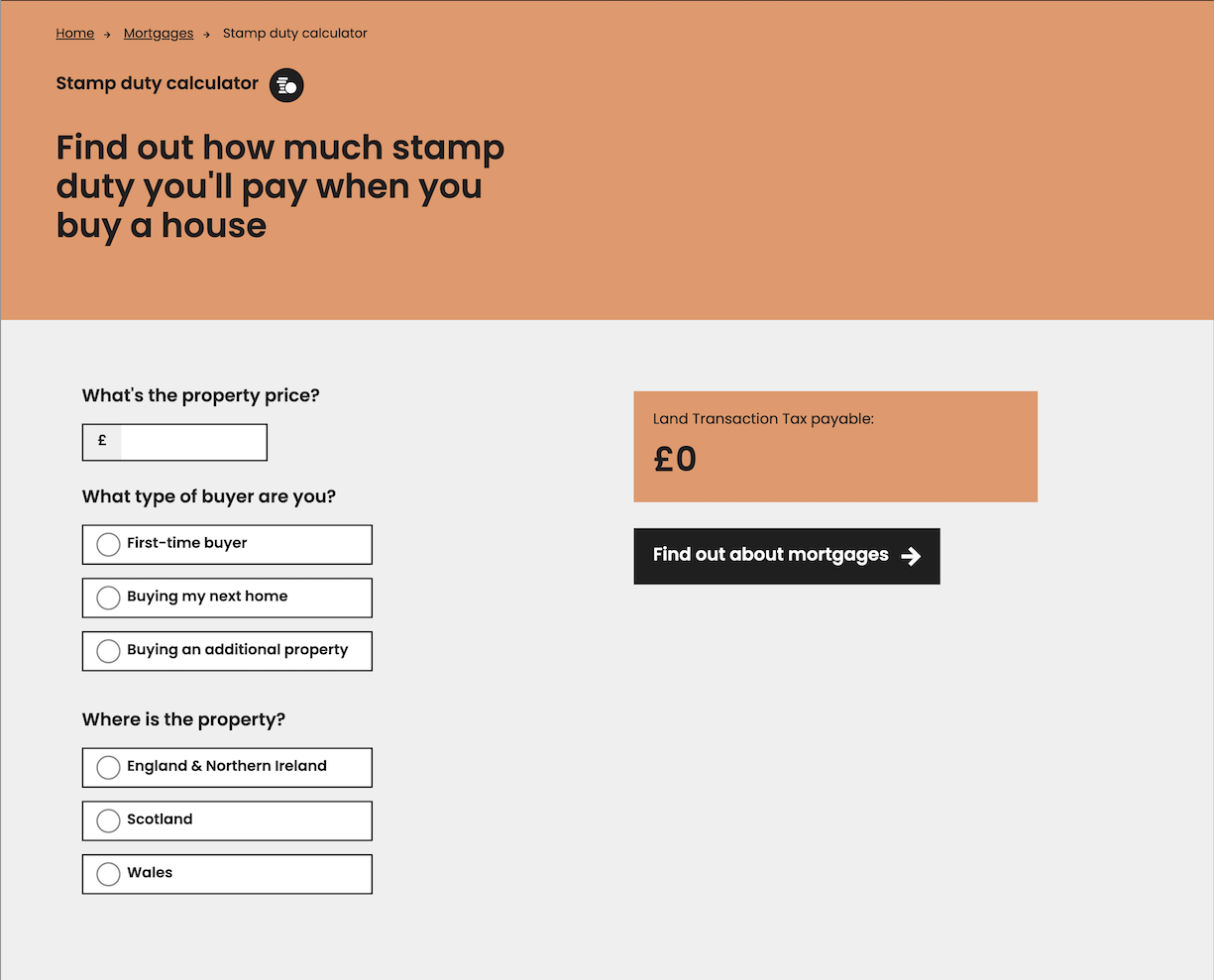
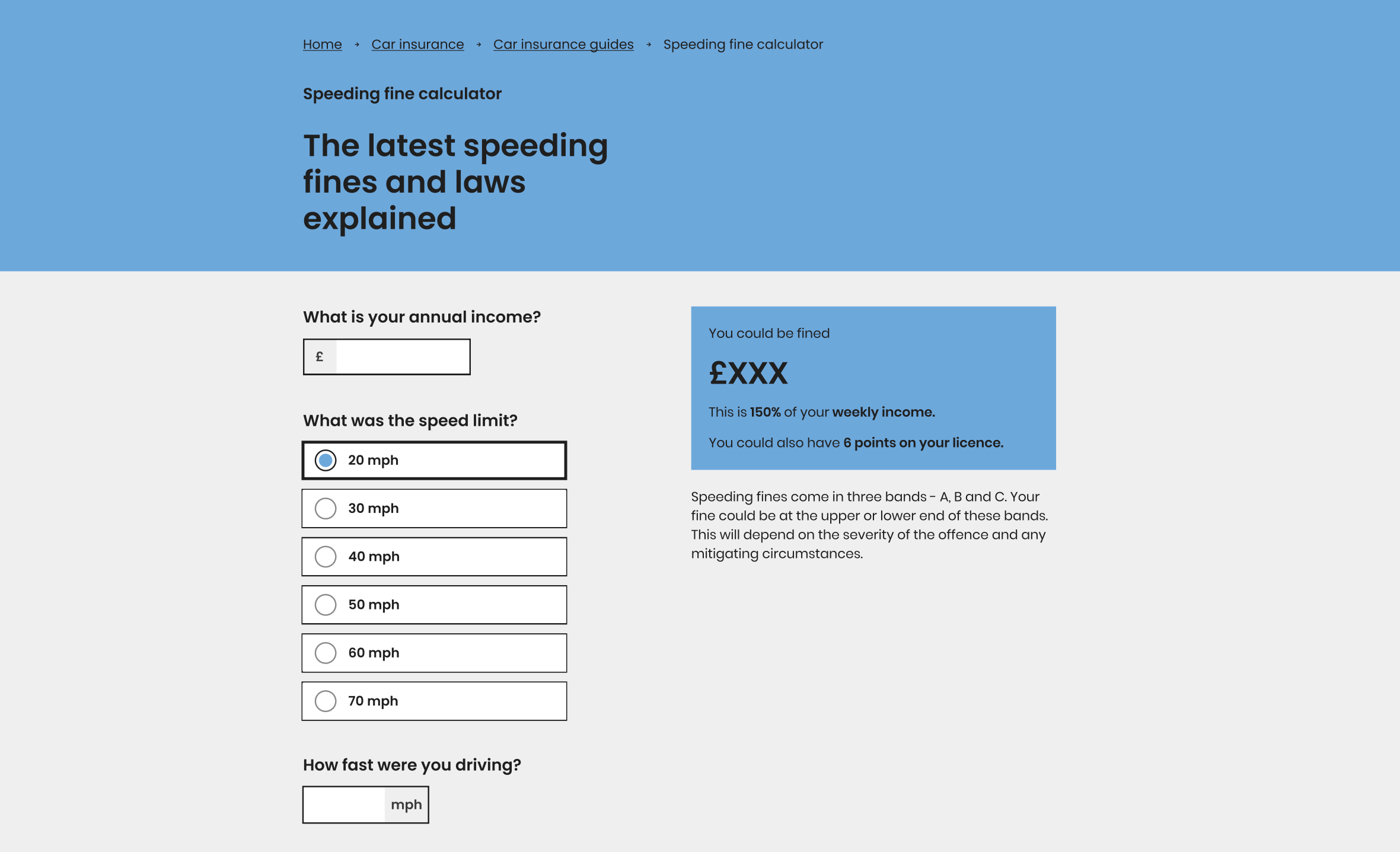
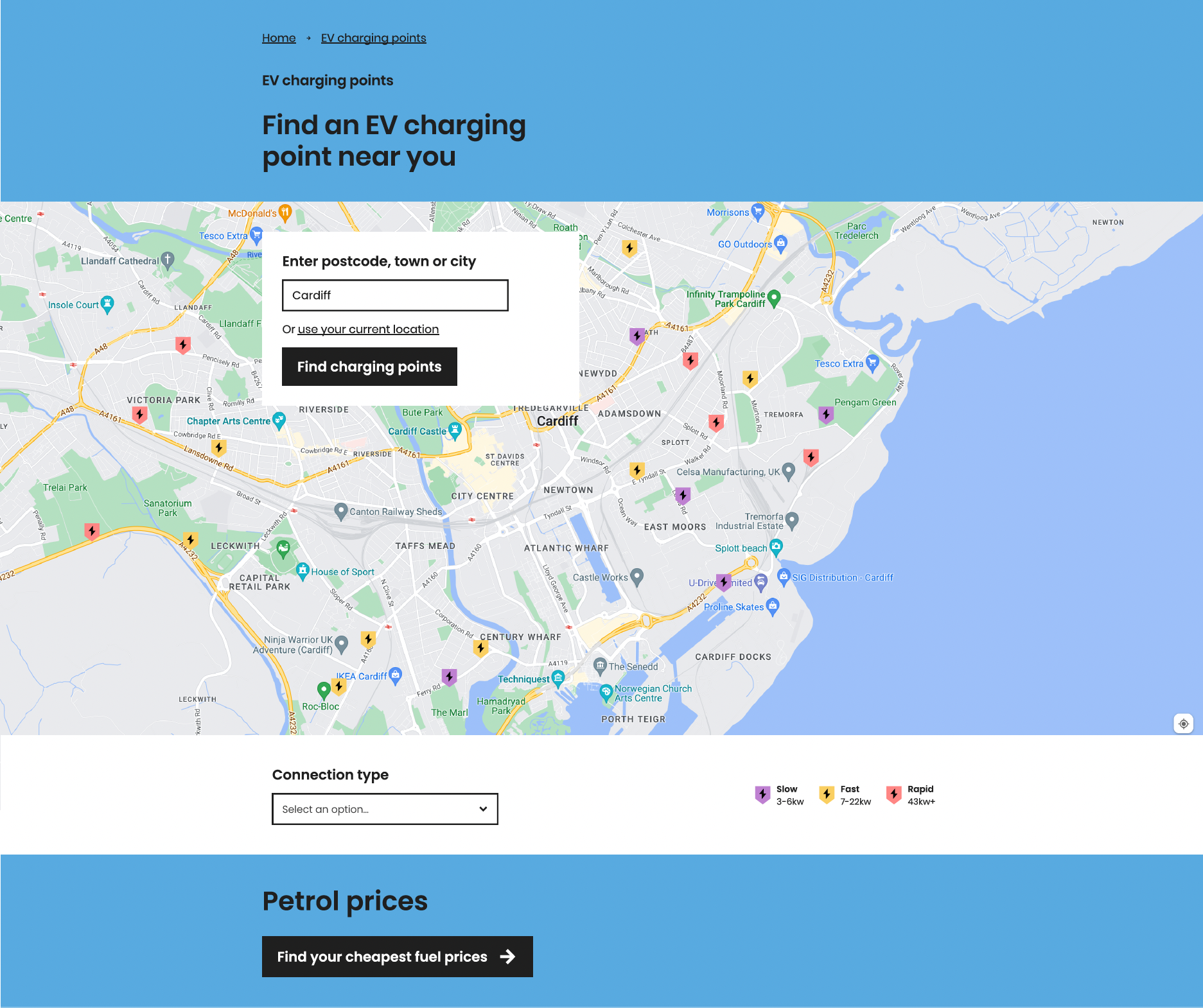
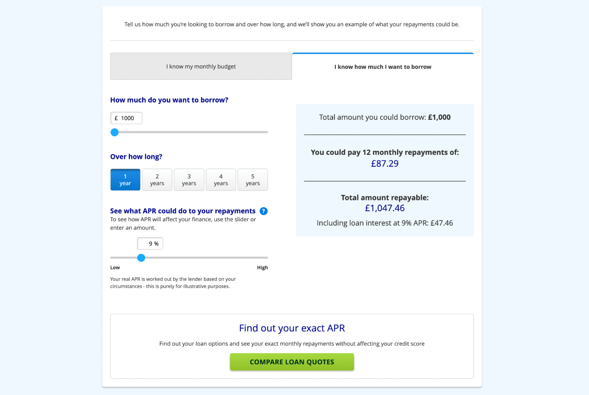
I created and documented a new tools and calculator process and progress board and shared it with the wider business. I also worked with a visual designer to recreate our existing tools and calculators. We created content and designs simultaneously while considering UX and UI best practices.
”Whilst I only had the pleasure of working with Courtney for a short period of time, I learned a lot about the importance of content design. One of our biggest projects together was to gather and reorganise all of the tools and calculators on the website. Redesigning them in the new style, updating the UI and UX and rewriting the content so it followed our new tone of voice.
Her devotion to her work is admirable. She’s never afraid to ask questions or propose new ideas and she’s always teaching fellow colleagues best practices on how they should think about the customer.”
Creating a new process
The first thing I needed to do was to create a new process for how we approached the creation and development of tools and calulators. I used Miro to create a visual step-by-step process based on what I’d established to be the best way of working by speaking to other teams and understanding how they approach their part of the project.
The process
Step 1: Analysis – finding the problems
While analysing the existing tools and calculators on the website, we reviewed the content and design to identify pain points and areas for improvement. The main problem areas included:
- Inaccessible design
- Poor user experience
- Confusing language
Step 2: Creating the Solution
To address these problems, we developed a plan that included the following solutions:
- Implement accessible design principles by using our redesign product colours, considering navigation and rewriting content.
- Improve the user experience by simplifying the user interface and creating a clear visual hierarchy.
- Rewrite content in plain language, using clear and concise wording that’s easy for users to understand.
- Remove content that doesn’t add value to the page or the user.
Step 3: Content Design and Collaboration
Working with a visual designer, we began a tools and calculators 2.0 project with the aim of implementing a new and improved approach.
Our strategy focused on creating clear and concise content that was easier for users to understand.
From a design perspective, we focused on creating an accessible and user-friendly design following UX best practices to create a simplified user interface.
We worked closely together on the project to ensure that the design and content were aligned.
